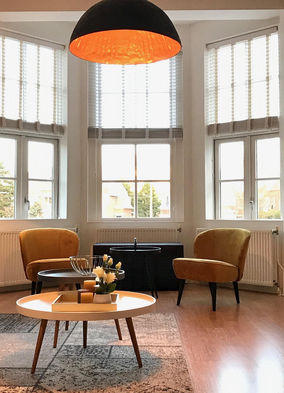
Butter yellow is having a moment, and it is easy to see why. It has all the warmth of a proper yellow without the shout — closer to softened cream than to a highlighter. In a living room, that matters. This is the room you sit in for hours at a stretch, so a color that lifts the space without demanding attention is worth far more than something dramatic you tire of by spring.
The other reason it works: butter yellow behaves like a neutral. It sits happily next to wood, cream, sage, warm gray and even black, which means you rarely have to redecorate around it. Below are twelve ways to bring it into a living room, arranged roughly from the smallest commitment to the biggest — so you can start wherever your nerve and budget allow.
1. Start with a single accent chair
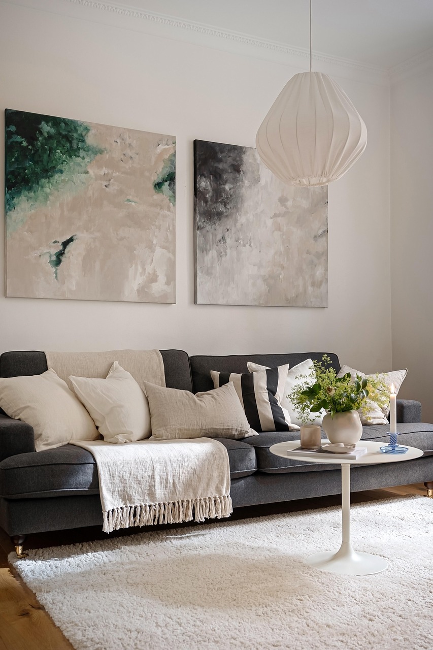
If you are unsure whether you like a color in your own light, buy one chair before you buy a gallon of paint. A butter yellow armchair in an otherwise neutral room reads as deliberate rather than accidental, and it gives you a movable test: live with it for a month and see whether you want more or whether that was exactly enough. Place it where it catches afternoon light — yellow looks flat in a dark corner and beautiful near a window.
2. Use pillows to spread the color around
One yellow thing looks like an accident. Three looks like a scheme. Pillows are the cheapest way to get to three. Scatter two or three butter yellow pillows across a sofa and a chair on the far side of the room, so your eye travels between them instead of stopping at one bright spot. Vary the texture while you are at it — a linen, a boucle, a fine corduroy — so the repetition reads as considered rather than as a matching set.
3. Try a butter yellow throw over a neutral sofa
A folded throw across the arm of a cream or oatmeal sofa gives you a generous block of color that you can remove in five seconds. It is the lowest-risk move on this list. Choose a weight that actually drapes — a heavy waffle cotton or a fine wool will fall into soft folds, whereas a stiff synthetic will sit on the sofa like a board and undo the effect.
4. Paint the inside of a bookcase or alcove
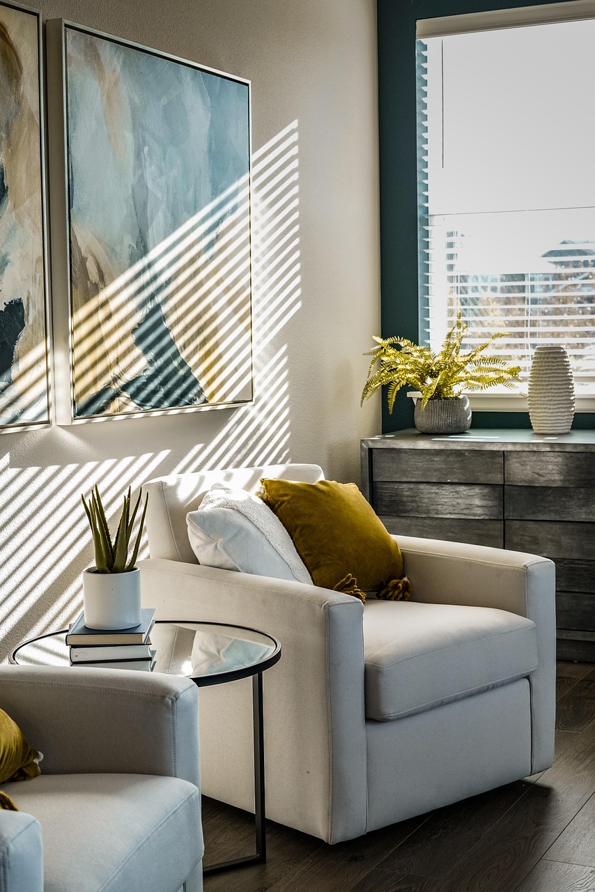
This is my favorite trick for anyone who wants real color without repainting a room. Painting the back panel of a shelving unit or the inside of a chimney alcove gives you a framed rectangle of butter yellow that glows behind your books and objects. It costs a sample pot and an afternoon, and because the color is contained by the frame of the shelf, it never overwhelms the room.
5. Bring it in through art rather than paint
A large print with butter yellow running through it lets you introduce the color and a focal point in one purchase. Look for pieces where the yellow is a supporting player rather than the whole canvas — an abstract with yellow through a third of it will tie into your pillows and throw far more naturally than a solid yellow panel. Hang it low enough to relate to the furniture, roughly at seated eye level.
6. Pair it with warm wood, not cool gray
Butter yellow has warm undertones, so it comes alive next to oak, walnut, rattan and cane, and it goes slightly muddy next to cold blue-grays. If your existing furniture is cool-toned, bridge the gap with something warm in between — a jute rug, a wooden side table, a rattan basket — rather than putting the yellow straight against the gray.
7. Use it on trim and baseboards for a quiet surprise
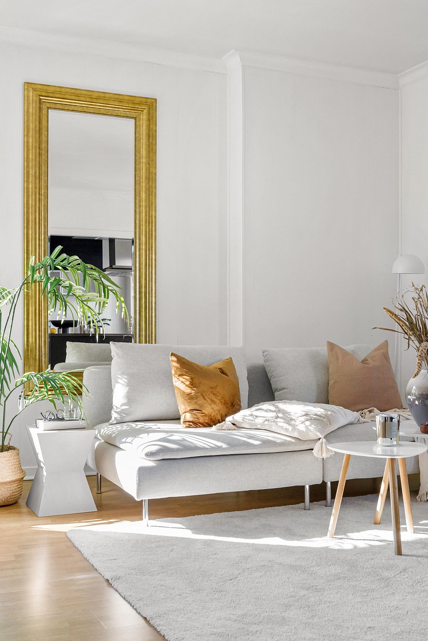
Painting woodwork a soft yellow instead of the default brilliant white warms the whole room without you being able to point at a single yellow object. It is subtle to the point that guests often cannot say what is different — only that the room feels sunnier. This works particularly well in rooms with north-facing windows, where standard white trim can read slightly blue and clinical.
8. Layer it into a curtain or shade
Light passing through butter yellow fabric fills a room with warm color for free. A linen curtain in a soft yellow acts almost like a filter on your daylight, and because curtains are large and vertical, they distribute the color up the walls rather than concentrating it in one lump. Go slightly paler than you think you want — color intensifies when backlit.
9. Add it underfoot with a patterned rug
A rug with butter yellow woven through a pattern anchors the scheme at floor level, which is where a lot of color schemes fall apart. Patterned is more forgiving than plain here — a solid yellow rug shows every crumb and every footprint, while a pattern hides both and still reads as yellow from across the room.
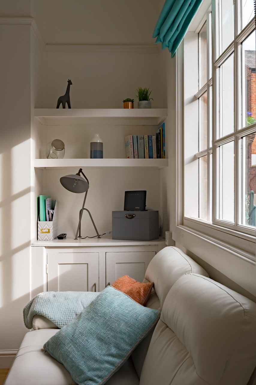
10. Commit to one butter yellow wall
If you want the full effect, pick the wall behind the sofa or the fireplace — a wall you look at rather than one you sit against. Test the color on a large piece of paper first and move it around the room across a full day, because yellow shifts more than almost any other hue between morning and evening light. What looks like fresh cream at 9am can look distinctly like custard under a warm bulb at 9pm.
11. Go all in with a butter yellow sofa
A full yellow sofa is a real commitment, so treat the rest of the room as its frame: keep the walls pale, the floor warm and the accessories quiet. Because the sofa is the single largest soft object in the room, it will set the temperature of everything else, and you will find you need far less other color than you expected. In a small room, this can genuinely work better than a dark sofa — it holds light rather than absorbing it.
12. Repeat the color in small objects to tie it together
Whatever scale you have chosen, finish by echoing the yellow in two or three small things — a candle, the spine of a book left face-out, a ceramic vase, a bowl on the coffee table. These are the details that make a scheme look like it was planned rather than assembled, and they cost almost nothing. Odd numbers and varied heights, always.
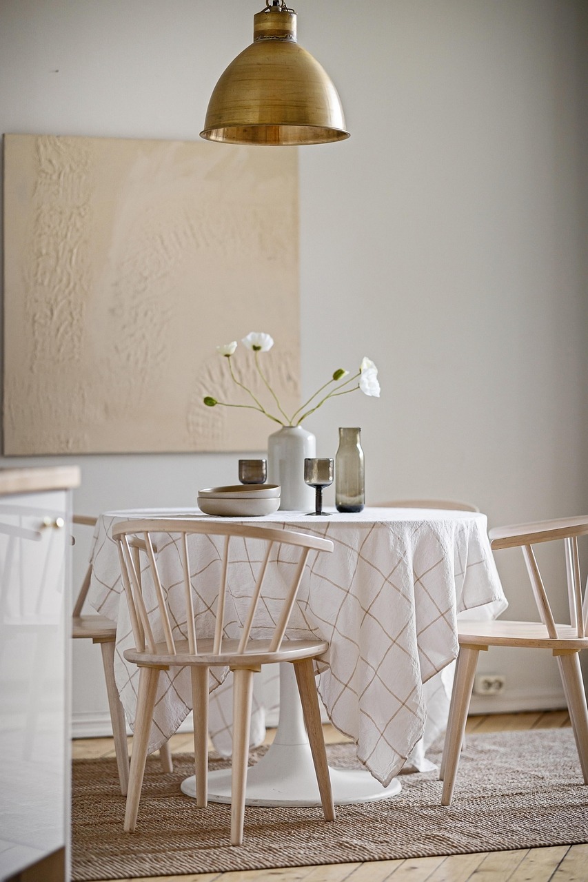
Colors that pair well with butter yellow
If you are building a palette from scratch, these combinations are the safest starting points:
| Pair with | Feels like | Best for |
|---|---|---|
| Warm cream and oak | Soft, sunlit, easy | North-facing rooms that need warming |
| Sage green | Calm and garden-like | Rooms that open onto a yard |
| Terracotta and rust | Rich and grounded | Fall-leaning, cozy schemes |
| Charcoal and black | Crisp and graphic | Modern rooms that need contrast |
| Soft dusty blue | Fresh and slightly coastal | Bright rooms with lots of daylight |
Mistakes worth avoiding
- Choosing from a screen. Yellow is the hue that shifts most between a monitor and a wall. Always get a physical sample.
- Using it in a room with no natural light. Butter yellow needs daylight to stay soft; under artificial light alone it can turn slightly green or sickly.
- Matching everything exactly. Three slightly different yellows look richer than three identical ones.
- Pairing it with cool white. A blue-white ceiling above a warm yellow wall makes the yellow look dirty. Choose a warm white instead.
- Forgetting your bulbs. A 2700K warm bulb flatters butter yellow; a 5000K daylight bulb flattens it.
Frequently asked questions
Does butter yellow make a small living room feel smaller?
No — if anything the opposite. Butter yellow is a light, high-reflectance color, so it bounces daylight around a small room rather than absorbing it the way a dark shade would. The thing that makes small rooms feel smaller is heavy contrast, so keep your trim close in tone to your walls.
What is the difference between butter yellow and cream?
Cream is essentially an off-white with a hint of yellow in it. Butter yellow is a genuine yellow that has been softened with white — there is noticeably more pigment. Side by side, cream reads as a neutral and butter yellow reads as a color, even though both are pale.
Will butter yellow date quickly?
Soft yellows have come and gone for decades without ever really disappearing, which is a good sign. If you are worried, put the color into things you can swap — pillows, throws, art — and keep your large investments in neutrals. That way a change of mind costs very little.
How much yellow is too much?
A useful rule of thumb is to let one color take roughly 60% of the room, a second take 30% and an accent take 10%. Butter yellow can sit comfortably at any of those levels — the trouble usually starts when two strong colors both try to take 30% and neither wins.
Where to start
If you take one thing from this list, make it the sample pot and the sheet of paper. Butter yellow is a genuinely forgiving color, but it is also the one most likely to surprise you between the store and your own living room light. Buy small, look at it for a few days, then decide how far to go.
For more ideas, browse everything in Living Room, or carry the soft-color idea through the rest of the house with our sage green bedroom ideas and cozy home office ideas.